Great data deserves great visualizations
 In any job, when making important decisions, good information is a great thing to have. For an emergency unit in a hospital, where people are making actual life or death decisions, having the best data at your fingertips is crucial.
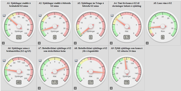
The dashboard above is a part of a project developed by the IT department in the Icelandic National Hospital for its emergency unit. It was developed between 2012 and 2013 and iterated on eight times before settling on the current design. Since its launch, nurses and doctors agree that the qualifiers on the dashboard have helped to streamline and improve the quality of their work. This dashboard is displayed on a screen visible to nurses, patients and guests of the hospital, and going over the numbers has become a fixed part of the workflow.
As a data nerd, I can appreciate that data is being collected, displayed and used to make better decisions — even if it means using this dashboard. But this dashboard could be so much better. It could display the data in a way that is easier to get information from. It could display more data in the same space. And it could look so much better.
Clean up time
In this dashboard, a lot of pixels are being spent on mimicking a real gauge. The grey colour, the shadows and the small number display on each gauge. None of that is helping the user understand the data.
Being a graphic designer my first instinct was to simply clean the dashboard up. My training is in communicating information with visual means. So let’s investigate what the gauges are communicating.
Each gauge has a scale going from green to yellow to red. Except, for some reason, the one on the top right. But let that one sit for a while. All the other scales on the screen have the same order of colours, but very different magnitudes for each band of colour. On one scale, when a needle is pointing to roughly 11 o’clock, that means everything is OK. On another scale, if the needle is pointing at 11 o’clock, it has gone a good way into the disaster zone. And that one gauge, the one in the top right corner, has the order of the colours reversed! This underlines that no meaning can be taken from the direction of the needles at all. That’s a lost opportunity to communicate.
Using red-green relationship on important data is not a good idea. Approximately 8% of men are colour-blind, which means that reading data with red-green colour coding is more difficult for them. This can be easily fixed by using a different colour scheme — blue and red, for example.
Furthermore, using three colours gives an indication that there are three categories of intensity, instead of a linear scale from things being OK to things being worse and finally bad. Here, a diverging colour scale would communicate that better by putting equal emphasis on the three classes in the data range .
Finally, we can make the needle direction mean something by normalizing the scales. Instead of having different lengths of colour bands, we make all gauges have the same length of colour scales. This makes it easier to scan the gauges to find important values: when a needle is at 12 o’clock all is well; when it’s not something is awry. This makes it very easy to scan the dashboard and spot problem areas. Below is my first version of the dashboard (image 1).
 Image 1
Putting it on the table
This fresher, cleaner design still bothered me. The labels on the gauges are sometimes hidden behind the needles. The eyes need to jump around a lot while reading. From the title of a gauge, to its value, to its label etc. Normalizing the scales gave the dashboard a unified look and more purpose to the needles, but we lost the some nuance in the scales. And most importantly, the extreme values aren’t highlighted. When things are important, they should ask for attention.
I tried putting a bright red oval behind the extreme values. A more subtle way might be to put a red dot inside the gauges. But these exercises are working around the problem; I’m not addressing the elephant in the room. The gauges themselves. What will happen if we just stop using them and order the information in a simple table?
With the data in a table we now have a lot more room for the labels. We don’t need to center-align the label text, so it can be read from the left to the right, from label to value. And important values can be highlighted (image 2).
Image 2
But the context of the scales is now lost. With a maximum and minimum value, we got a feeling for the location of the value. Now all we have is a number without context. So let’s get some context back; loosen the table up and add some bullet charts (image 3). I made up the color class labels, as you can probably guess (if you speak Icelandic).
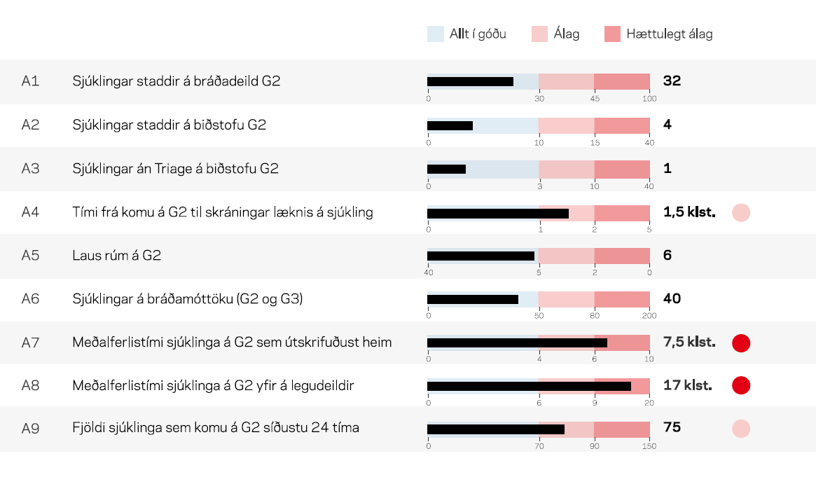 Image 3
That’s more like it! The length of the bar indicates how much trouble the emergency unit is in. There are labels on each bullet chart that give context to the scale of the problem. But we can show even more. What if we could see if the current values are going up or down? If we change the bars to bullets, we can show the value measured before the most recent one as a faint bullet (image 4).
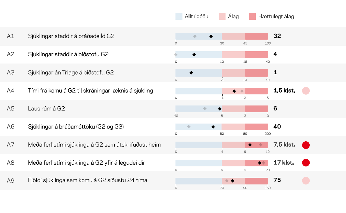
Image 4
Now we can see that even though A7 and A8 are in the red, they are moving down. And although in the blue, A1, A5 and A6 are moving fast up. Now we are starting to provide more information than the original dashboard. And I think we can get even more. But let’s undo the normalization of the scales and partly reintroduce colour classes of different sizes. I want to keep the reddest danger zone intact because if I would change that too the original problem of misaligned information from the needles (now points) would resurface (image 5).
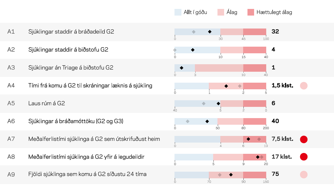
Image 5
Now A3 has the long Álag that it had originally. The red ovals are still in the same place, to make it easier to glance if a bullet is in the danger zone. This dashboard is clearer than the original, which makes it quicker and easier to read information from it.
There is one thing in the original charts I haven’t mentioned yet. You’ll notice that some of them have a small button to the top left of the gauge. That’s a link to a line chart of this data, showing the last day, week or months’ worth of values. Click a button and you will summon up a line chart filling the whole screen. In a dashboard full of gauges, you have no room for extra information. Now, however, we can easily show all these hidden values as sparklines (image 6).
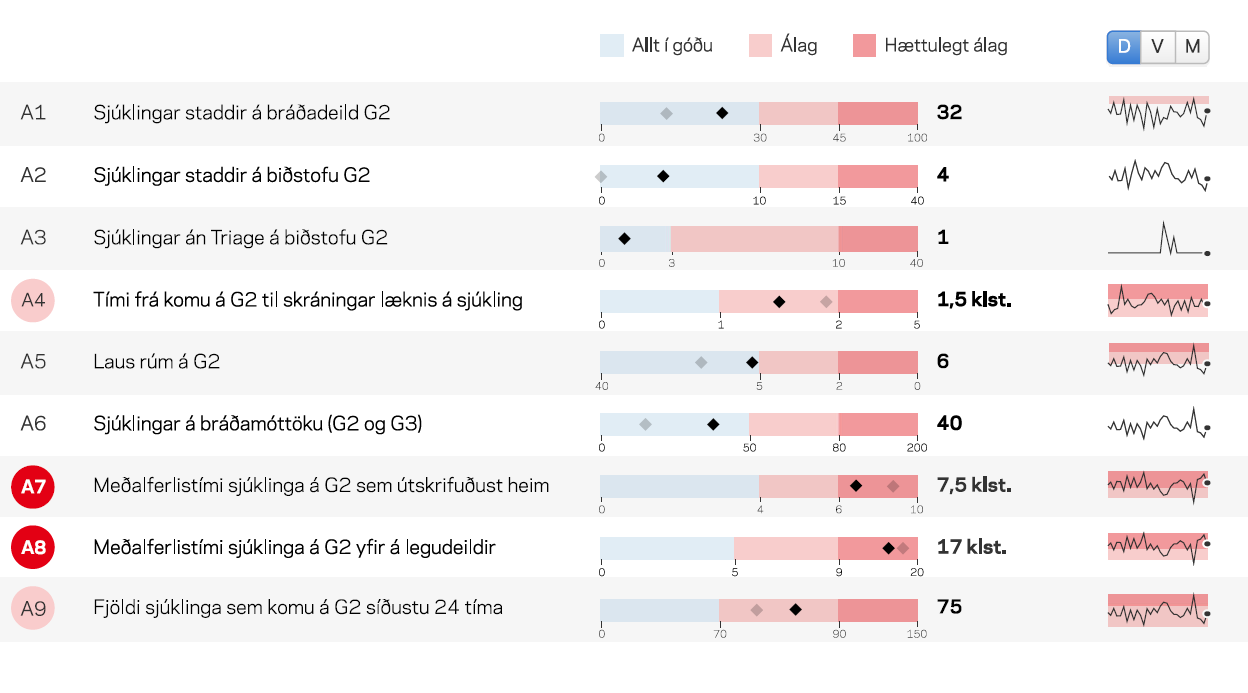
Image 6
To make room for the sparklines I moved the red ovals into the first column. The sparklines show the trend for the last day, week or month. The red bands on the sparklines show where on the colour scale the line has been for that time, omitting blue for clarity.
I get excited when I hear of new ways that visualizing data can help people do their jobs better. But it saddens me to see great data drown in bad design — especially design that mimics real-world objects for no good reason — and to see that design fail to communicate the data. We can do a lot better. And we should.
Author: Þorlákur Lúðvíksson, graphic designer, UX and UI designer and a data visualization specialist. He teaches data visualization in the University of Reykjavik.
Blaðið Tölvumál

Skil á efni
Leita í vefútgáfu Tölvumála
Um Tölvumál
Tölvumál - tímarit Skýrslutæknifélags Íslands er óháð tímarit um tölvutækni og hefur verið gefið út frá árinu 1976.
Vefútgáfa Tölvumála birtir vikulega nýja grein á vef Ský og árlega er gefið út veglegt prentað tímarit undir nafninu "Tölvumál" þar sem fjallað er um tölvutækni frá ýmsum sjónarhornum og er þema blaðsins jafnan valið snemma árs og útgáfa að hausti.
Ritnefnd Ský sér um að afla efni í Tölvumál og geta allir sem áhuga hafa sent inn efni.